|
I much prefer the raw edge. This small verse from this section seems to serve as an explanation: I don’t know. This is strange. Nothing is responding properly. Is it me? The computer? Life? Most of the poems are rants probably best spoken out loud, like one I particularly enjoyed about people who wear sunglasses indoors and why. I envisioned the poet wearing sunglasses while reading it and really playing it up for the audience. There’s not a lot of rhyme to the verses, but I was glad. I think this type of book, with its mix of poems and art, would have seemed even more “greeting card” like had the poems contained a more metric verse. That aside, some of the poems do have sing-songy titles which I found to be distracting like “IntentionsIntentlyIntended” and “Dancing Daisies.” Most of the time, I enjoyed the poem more itself after having ignored its title all together. My favorite poem of the lot was actually one of the more simpler ones called “He Brings Yellow Flowers to the City.” For me, it’s the best example of the type of word art a poem should convey. It paints a very clear and distinct picture and leaves the viewer/listener maybe wanting just a bit more, but left with a rambling of their own thoughts that can take them in any direction. Here is the poem in its entirety: There’s a man On the street corner Selling yellow flowers To passersby. He’s tall and so So thin With inch thick black rimmed Glasses worn high On his face. Salt speckled thick hair Sweeps over his eyes And a long, glowing white Cigarette stands erect Under his nose. He shaved this morning, But he’ll need to again soon People, people Take a flower and Carry it in the city. Yellow flowers are here!
0 Comments
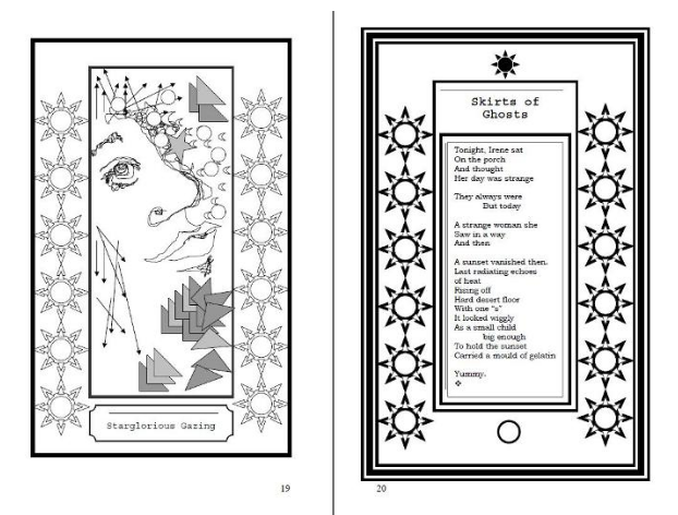 As for the art, it’s an odd mix of shapes, repeating patterns, and doodles, reminiscent of and probably inspired by the likes of Warhol, Escher, and Van Gogh. Most of it, for me personally, didn’t really create a connection between it and the poetry. I also felt some of the art would have been better had it been printed in color when it came to pieces that used specific shapes, but that would have definitely increased the cover price of the book itself which is unfortunate. I think the connection is lost due to a lack of color. The artwork with a border is also not symmetrical in size to the poems with borders, that while not really necessarily, does create an odd balance when you are looking at two pages at once. Therefore, I write my essay to talk about this creation of Chazda Albright. Here’s an example: My personal tastes in art lean more toward the doodles and sketches although a large carpet on my living room floor displays a repetitive pattern of squares and circles resembling martini olives that I believe Mr. Warhol himself would have loved. I certainly appreciate pop art, but I think the lack of color is what turned me off to most of the pieces in this book. But, I did particularly like the sketches that were meant to resemble people. Here’s one of my favs called “unartist.” The biography of Ms. Albright in the back of the book lets us know that she is self-taught, but has had a number of personal art exhibitions throughout the western US and in Germany. She has written some erotica under a pen name and is currently at work on a fantasy thriller screenplay. I commend Ms. Albright for using self-publishing to its full potential in creating both a work of art and a collection of poetry that is exactly what it should be: a presentation of one’s true self. Like a good museum or a good book, I enjoyed my time here. So, that is it for today's review. Thank you so much for reading! I hope you liked it. If you did, and even if you did not, please share your opinion the the comments section below. I am very interested in what you have to say, it helps me to make my blog a bit better every day. Thank you again and have a nice day! xoxo 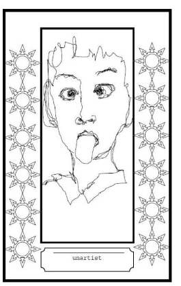 |
AuthorWrite something about yourself. No need to be fancy, just an overview. ArchivesCategories |
 RSS Feed
